The icons weren't changed just for the sake of changing them. The changes were made based on research conducted by the National Center for Atmospheric Research (NCAR) in Boulder, CO, and by comments collected from users last year. Researchers surveyed people from across the country and found that most had been frequent and long-time users of the map interface. Researchers tested the former icons and the newly designed icons and presentation format. They found that the colored boxes drew attention to watches and warnings, and users were more aware of hazardous weather threats with the addition of start and end times to the hazard information. If you would like to read more about this research and evaluation see "Improving effectiveness of weather risk communication on the NWS point-and-click web page".
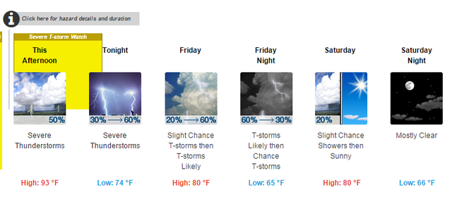
This is the sample forecast presentation that the NWS has on its page explaining the change in format. Note that in periods where the probability of precipitation is increasing or decreasing that change is shown on the icon. A yellow hazard box highlights the period of a severe thunderstorm watch, and also includes the icon for the first period of the forecast. The severe thunderstorm watch is also highlighted in the 12-hour forecasts in the background. The icon for Saturday depicts the expected weather for both the early and later part of the day.

If there are multiple watches and or warnings, these can be displayed as well. In the example below the forecast for Muskogee, OK for Wednesday depicts a Flash Flood Watch (yellow) into the evening (7:00 p.m. in this case) and a Flash Flood Warning (red) until 1:30 p.m. This information can be seen by clicking the "i" button at the top or on the multiple hazards box.

In the example below, a Red Flag Warning (favorable conditions for wildfire) is in effect for Jordan Valley, OR.

The point and click forecast pages on the NWS web sites receive on average 2 million hits per day, and during major severe weather events that number is substantially higher. If only, say, five percent of those viewing the page have a better understanding of the forecast and weather risk, that's tens of thousands of people who are more aware.
The NWS has a web page that lists all the weather conditions/forecasts and their associated icons (more than three dozen of them). They will continue to accept feedback about the new forecast-at-a-glance presentation and icons, and an email address to do so is provided on the page.
No comments:
Post a Comment